Student Career Portal Research
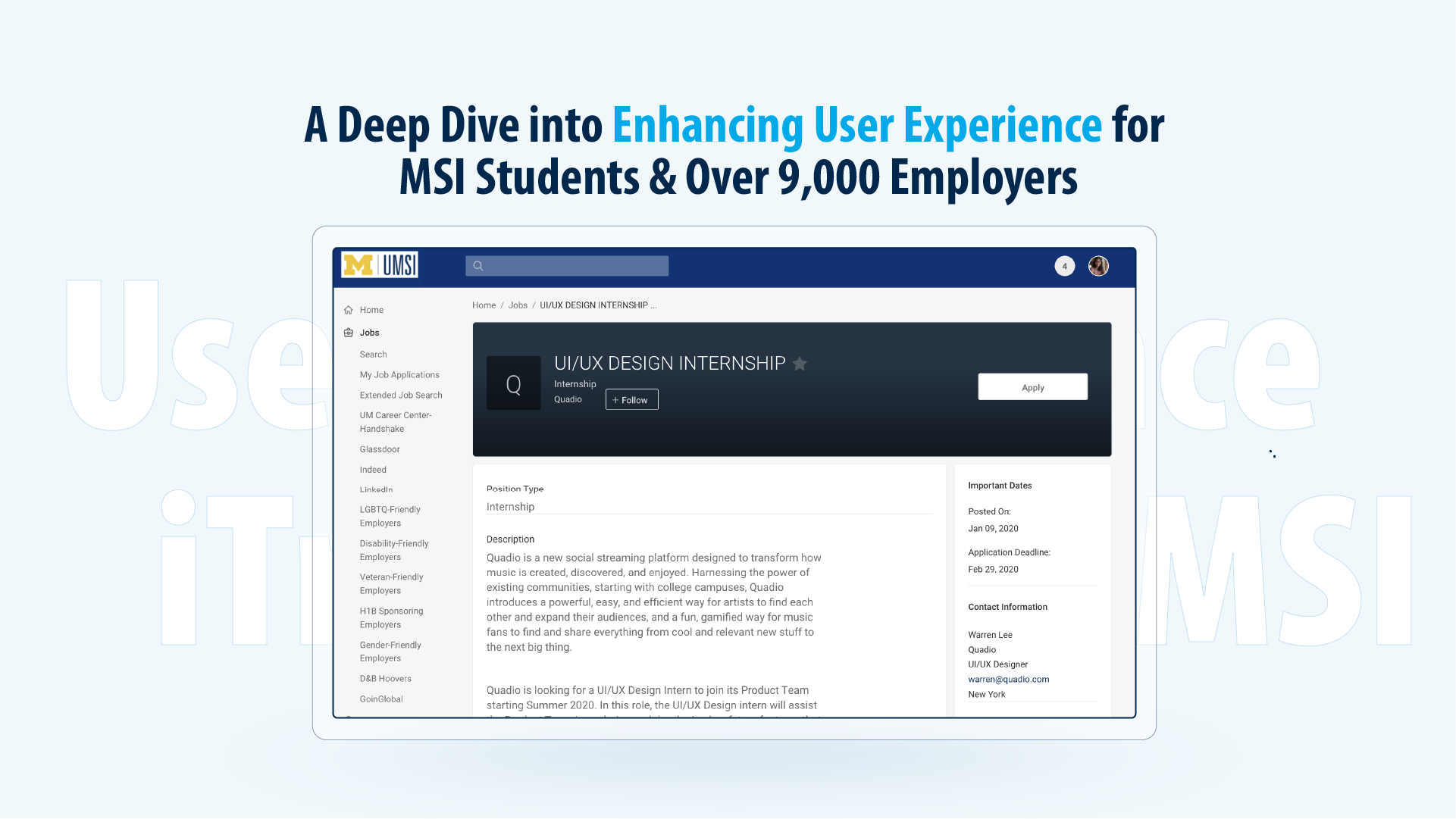
iTrack, is a powerful resource for MSI students seeking to find relevant job and internship postings, to RSVP for professional development events, to book advising appointments, and to look up contact information for more than 9000 employers. However, we learned from Assistant Director Katie Dunn that the CDO has not yet been able to conduct any kind of user testing on the platform. As such, the service likely contains certain usability challenges which a comparative analysis will help contextualizeMy Role
User Interview, Survey Design, Data Analysis, Design Suggestion
Outcome
1. 6 User Interview / User Testing
2. User Perception Survey
3. Testing and Interview summary for future iteration.

Background
1. Client NeedsCareer Developement Office(CDO) hopes to understand the student’s perceptions towards the using iTrack web platfrom, identify different user feedback and collect suggestion to help inform decision making to improve iTrack overall user experience.
2. iTrack Key Functions
Job Search, Event Registration, Career Advising
3. Challenges
CDO has not yet been able to conduct any kind of user testing on the platform. As such, the service likely contains certain usability challenges which a comparative analysis will help contextualize.
iTrack is Symplicity-powered career development software, therefore CDO dosen’t have development side authority, therefore it’s helpful for them to collect and surface the types of change and issues they need most of their attention on.
Research Scope
The research used a combination of different research approaches to help our client gain insights into the student user awarenesses and needs for iTrack functionality, web information structure and accessibility, and benchmarking among different competitor products at the time in higher education.1. Competitive Analysis
2. User Interview
3. User Perception Survey
4. User Interface Audit
Research Process
Our process involves a few important runs of research:
1. Ask: ask our client questions and define the problem.
2. Prepare: collect data by collecting and storing the information
3. Build: create research plans to build ways to collect data
4. Analyze: data exploration, visualization, and analysis
5. Share: communicating and interpreting results


Example Usability Issues
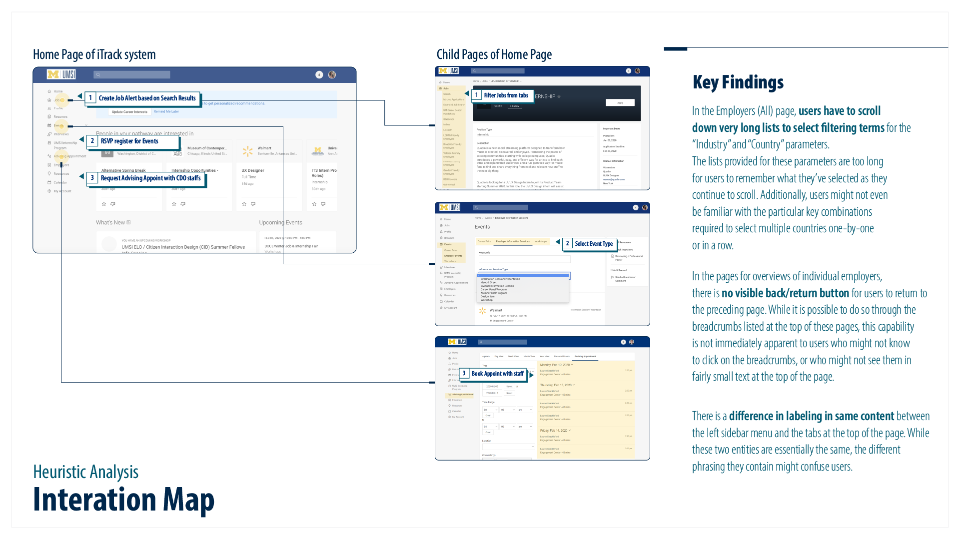
Issue 1: Creating job alerts is often difficult for users, with one participant even giving up on the taskWhy is a problem: For this task, the participant is asked to create a job alert for the roles that he or she is interested in. The job alert link is not very discoverable, so the participant missed it and could not complete the task even after several attempts. All participants struggled to identify how to create a job alert. Lack of visibility for the necessary buttons caused problems for all three of these participants.

What to consider :
Option 1: Isolate the ‘create job alert’ button from the group, and make it a stand-alone button, which is more discoverable by the user
Option 2: Adding a “create job alert” button at the top of the pop-up window when users have not created any previous job alerts.
Issue 2: Left-hand side menu is too lengthy and confusing for users to navigate.
Why is a problem: Participant missed the ‘job alert’ when they first landed on the job search page, and eventually could not complete the task.
For this task, the participant is asked to create a job alert for the roles that he or she is interested in. The left navigation menu on the system interface provides users with too many options. Participants reaction suggested that too many options make users lose direction with their options. And the long list of options frustrates them with each search for the correct path.

What to consider :
Option 1: The criticality of various features on the left-hand navigation menu should be identified and ranked.
Option 2: Redesigned the left-hand side menu.
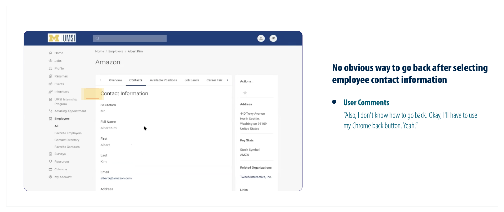
Issue 3: Improve Wayfinding
Why is a problem: There is no obvious way to return to the previous page after selecting individual contact information within the Employer Contact Directory. For this task, the participant is asked to find the contact information for an employee at a given company in iTrack. After clicking on a specific employee’s contact information, the user finds it difficult to go back to the list of contacts, and have to do so through the browser’s back button.

What to consider :
Option 1: Create an obvious back button, allow the user to return or exit the current page.
Option 2: Make the breadcrumb menu more discoverable to the user.
Credits
Project Scope
User Interview
User Flow
Usability Analysis
Competitive Analysis
Research Design Suggestions
Time
Jan – Apr 2020
Team
Client
Jinghan NiScott Louis
Riddhi Vaidya
Client
University of Michigan, UMSI Career Development Office